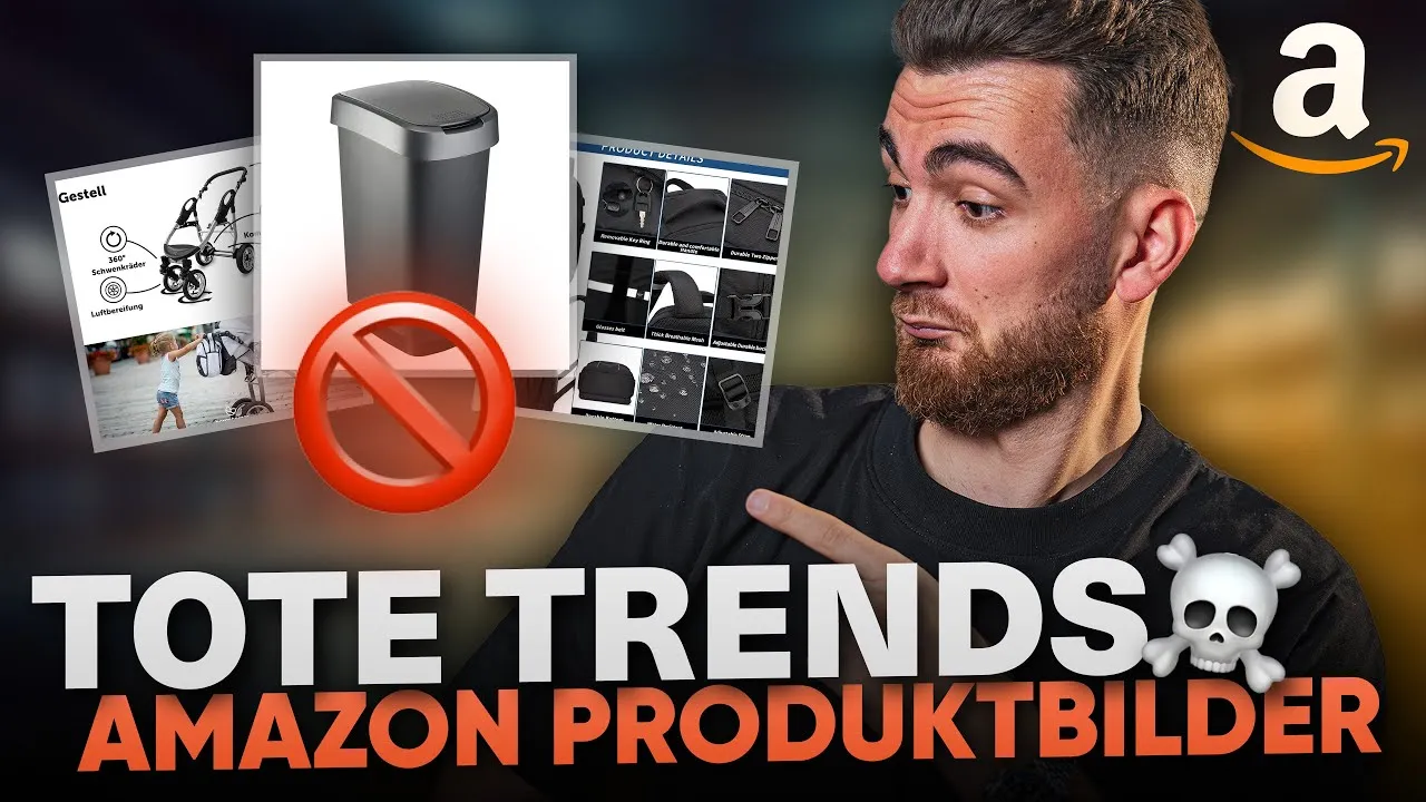
The worst Amazon FBA product images trends 2025 - you need to avoid them now

The e-commerce market is growing, the competition is not sleeping and Amazon customers are becoming increasingly demanding. What inspires today can ruin conversions tomorrow. That's why it's high time to take a critical look at old product image trends and review your own Amazon listing with a fresh eye. In this article, you will find out which image styles worked well in the past, but are now reducing your sales figures, and how you can score points in a contemporary way instead.

Developments in Amazon marketing: what has changed fundamentally
Amazon marketing thrives on customization. The focus has shifted significantly in recent years: From pure product images and sprawling text deserts to clear, image-rich messages that convince in seconds. The goal remains the same, but the path is different.
Conversion is the keyword. Today, users are no longer persuaded to make purchases by lifeless images or overloaded graphics. They expect information at a glance, understandable benefits and high-quality presentation - all within a few seconds. Old principles such as "a lot helps a lot" no longer work.
Changing trends in product photography:
- Previously: Elaborately staged still photos, overloaded infographics, endless comparative text
- Today: Clear messages, real benefits, visual presentation and high quality
If you don't regularly rethink the image design of your listing, you're missing out on sales. That's why it's worth taking a close look at these four mistakes that will really slow down your success in 2025.

Mistake no. 1: Boring breastfeeding photography without additional information
Still photography used to mean: a beautiful photo showing the product, sometimes in use, but without any text overlays, highlight icons or additional information. Major brands and vendors still use this style today. As a result, it often looks classy for the customer - but it simply doesn't stick.
Why pure still images are no longer enough:
- You only have seven pictures to convince.
- Users hardly ever read the product description, often not even the title in full.
- Extended Brand Content (EBC) is quickly lost if it gets lost in blocks of text.
- USPs (unique selling points) cannot be communicated quickly.
Typical disadvantages of pure still photos:
- Statement missing or lost in context
- Important product benefits remain invisible
- Conversions fall because the "aha moment" when scrolling through is missing
Example of typical still photography (earlier):
- Glossy photo of a hand mixer on a white background, no information, no explanation.
- Lifestyle scene: Product in kitchen, but with no indication of features or added value.
How can you do it better?Use a combination of strong images and concise text. Highlight advantages visually, use concise slogans or icons - this shows at a glance what makes your product special. A good guideline: less is more, but without any information you will lose the customer.
Always consider: What should the customer really have understood after five seconds?
Mistake no. 2: Images that are too full overload the customer
The exact opposite is just as problematic: too much information, too small fonts, too many icons on just one image. Especially with more complex products such as baby carriages, you often see that all the benefits, features and extras are crammed into a single image.
Classic example:A manufacturer like Kesser shows 7 to 10 different product features on one image, often with lines, icons and long texts. This seems informative at first, but is completely overwhelming.
Why this is failing today:
- Nobody can categorize seven advantages in five seconds.
- The message is diluted because too much is communicated at the same time.
- Customers are overwhelmed, move on and miss the actual USP.
The golden 5-second rule:
Show someone the picture for 5 seconds. Can they then say what the main argument was?
Dos & don'ts for image composition
- Show a maximum of 2 to 3 advantages per picture
- Clear icons, no text blocks
- Less is more - focus on real core statements
- No tiny explanatory texts - keywords are enough
- Relevant advantages at the beginning, leave out secondary matters
Table: Dos & Don'ts in image design
DosDon'ts2-3 advantages per imageMore than 5 info per imagePithy icons & short textsLong continuous texts in the imageClearly visualize the main argumentSmall features and details everywhere
An overloaded image gallery may bundle information in the short term, but it doesn't really lead to more conversions for many customers. Instead, use snappy headlines, individual icons and place only one main benefit per image - the rest can be placed on other images or in the EBC.
Important: Of course, manufacturers like Kesser can also be successful with poor images if, for example, they score with particularly low prices or a strong sourcing model. But if you want to sell with quality and not just price, you need to improve your image design.
Mistake no. 3: Bad stock images and unattractive product images
Many retailers still rely on generic stock photos - especially those that come cheaply from mass catalogs or from suppliers in the Far East. They can often be recognized by unnaturally placed products, strange lighting situations or a lack of depth of field. They do not look authentic.
Not all stock images are the same. There are:
- High-quality retouching: Seamlessly integrated, cleanly finished, unobtrusive.
- Poor, simple stock photos: product "photoshopped" into a living room environment, cheap look.
What happens if you use bad stock photos?
- Customers become skeptical: they sense a cheap solution or inferior goods.
- The competition never sleeps: Whoever produces real photos will outdo you.
- There is a lack of trust because the image does not match the customer's quality standards.
Large retailers and wholesalers in Germany have also worked with stock photography for a long time. However, the market has learned something new and many are increasingly investing in customized images because they have realized that good image marketing is decisive for sales: Good image marketing determines sales. Cheap stock images act like an invitation to the customer to choose a different offer.
Recommendation: Invest in high-quality photos of your own product that present the product in a credible, high-quality and clean way. Only use stock photos for backgrounds, never as the main motif.
Do you want to be perceived as a brand? Then show that you mean business - with real images.
Mistake no. 4: Comparison images with too many dots and text deserts
Comparison images are one of the classics in Amazon listings. In the past, they were usually implemented like this: Two columns, side by side for each product, with four, five, sometimes more comparison points per image underneath. "German manufacturer vs. no German manufacturer, Prime shipping vs. no Prime, good quality vs. poor quality."
Why does that no longer work today?
- Customers skim images. They do not perceive text deserts.
- Too much information is simply hidden.
- There are no real reasons to change.
How is it better?
The new comparison strategy:
A maximum of 1 to 3 relevant advantages per image.
Choose the points that make the real difference. Nobody is interested in "0.6 mm vs. 0.4 mm thickness" if the advantage (e.g. "never tears") is not clear at the same time.
Dos & Don'ts
- Do: Present advantages visually, for example using symbols or striking quotes (e.g. "Our product cannot tear - guaranteed!").
- Don't: Long text lists or confusing points tables
Practical example:
A manufacturer finally launched a product that was previously only available in powder form as a shot. Perfect for comparison - but not as a text list with five points. Instead, the advantages are presented visually: "With powder, it takes 2 minutes, with the shot, one twist and you're done." Or: "Three shot bottles for on the go instead of large shakers and cans."
Visualization decides:
- Show the main problem (e.g. awkward shaking and mixing)
- Show your solution (open the shot, drink up, done)
- Use icons, photos and short headlines instead of blocks of text
If the product is really fundamentally better, then a single, clearly conveyed advantage is usually enough. If a comparison is too complex, show it in the video.
Practical tips for your Amazon product listing
The most common image errors are quickly recognized, but often difficult to correct. Here is a checklist that you should check for each product image:
Image check for your listing:
- Only product image without information?
→ Better to combine: Image plus concise benefit. - All features in one image?
→ Reduce: Maximum 2-3 per image, better to split up. - Used cheap third-party images?
→ Have your own photos created, quality pays off. - Comparison images as a text desert?
→ Pick out clear, visual advantages.
Remember: trends are constantly changing. Your conversion depends on every little thing. It's better to focus on a few strong statements per image than on masses. Test new approaches regularly and see how your figures develop.
Professional support: the free strategy meeting at Stacvalley
If you want to sell efficiently, you need to regularly optimize your image strategy and listing. An experienced partner - such as the Stacvalley team - can help with this.
What does Stacvalley offer?
- Free, 1.5-hour strategy meeting: Together with an expert, you will develop a detailed concept for your listing.
- Tailor-made solution: The meeting ends with a practical guideline that you can implement yourself or develop further together.
- Further support: If you want to continue after the first interview, this is possible on request.
Sign up now for a free initial consultation on the Amazon image concept - you will receive well-founded feedback and an individual concept. Even if you want to implement it yourself afterwards, you will benefit massively from new impulses.
As Luca Igel likes to emphasize:
"In one hour, we will take your listing to a completely new level. You can get started right away and be a big step ahead of your competition."
Useful resources and further links
Benefit from more know-how and best practice at first hand:
- Follow Stacvalley on Instagram for the latest insights and image ideas
- Join the Amazon community on Facebook to exchange ideas and tips on product images
- Deepen your knowledge of listing optimization with the hashtags: #amazonfba #ecommerce #amazon #fba #productimages
Try it out for yourself: Create test images with less information, focus on quality and check the conversion. Compare results regularly with old listings.
Conclusion
Old image trends on Amazon cost sales. If you want to sell successfully today, you have to leave plain product photos and overloaded layouts behind. Focus on high-quality, custom images with clear, vivid messages, a few key messages per image and real customer benefits.
Test what really works and consult experts if you notice that your ideas are running out. With clear, modern images and regular optimization rounds, your listing will not only be more beautiful - but also much more successful.


