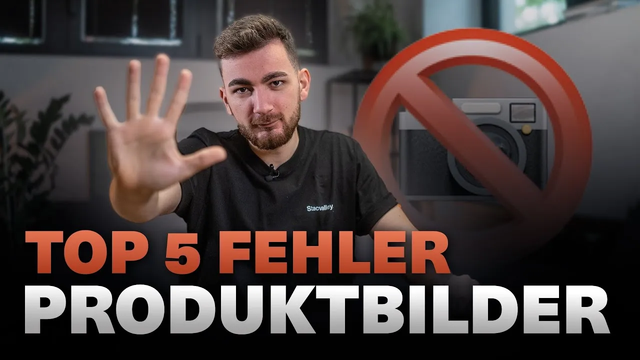
Your product images on Amazon should NEVER look like this: The 5 most fatal mistakes you need to avoid

On Amazon, product images are often the deciding factor between a successful sale and an abandoned purchase. No matter how compelling your text is—in the end, the images are what matter most. For customers, they are the storefront of your listing. A strong image not only conveys information but also triggers emotions and instills confidence. If you don’t take advantage of this opportunity, you’re throwing away conversions—and with them, revenue. In this post, you’ll learn about the 5 most common mistakes with Amazon product images that will put you out of the running. If you avoid them, your conversion rate can quickly double or even increase tenfold.
Why good product images on Amazon are crucial
The very first glance at an Amazon listing reveals the differences between successful and unsuccessful sellers. Pictures are the be-all and end-all. Customers often compare several listings and don't usually read long texts or bullet points. They rely on what they see. This is precisely why good product images have a massive impact on conversion.
A single glance at the main picture is often enough to decide: "I want that!" Or not. Mistakes in the image design or presentation have a deterrent effect on potential buyers - usually even unconsciously. As an Amazon consultant, I come across the following mistakes on a daily basis, but they can still be rectified quickly. Use these tips to get the most out of your listing.
Mistake 1: You are not using the full image potential of Amazon
Maximum number of images in the gallery
Amazon gives you the option of uploading up to 7 or even 9 images for each listing. But what do I see again and again? Retailers only upload 2 or 3 photos. For customers, this means less information and more unanswered questions.
Why should you use all the picture spaces?
- Each additional image answers another customer question.
- You present your product from several sides and in many situations.
- Your offer looks more professional and trustworthy.
Example: Drinking bottle - this is how you could fill the seven available picture spaces:
- Cover picture (your bottle in the best light)
- 1-2 application images (e.g. during sport, at school or when traveling)
- Picture with size and dimensions (How big is the bottle? How much fits inside?)
- Picture with product benefits (USPs: BPA-free, insulating, extra light)
- Close-up (e.g. lid, cap, drinking opening)
- Comparison image (e.g. in comparison to other bottles or standard sizes)
- Further USP images (e.g. special color, accessories)
Each of these images gives the customer more certainty and makes your product more tangible. If you only show three images, you leave at least half of the possible information by the wayside - and risk the customer opting for the competition.
Why the 8th and 9th images are often not displayed
Currently, Amazon usually displays seven images in the gallery. Only when a customer actively scrolls further in the gallery do images 8 and 9 become visible. However, most buyers are unaware of this and rely on the first seven photos.
My tip: Have more pictures ready in case Amazon changes the display options again. That way you'll be prepared immediately.
For more details on the requirements, take a look at the official Amazon guidelines for product images to keep image sizes and specifications up to date. The comprehensive Amazon Product Images Guide (2025) also explains what is technically and content-wise possible.
Mistake 2: Your images appeal to the wrong target group
Selection of suitable models
Buyers must be able to recognize themselves in your pictures. This means that suitable models are a must! The person in the picture should match your target group as closely as possible.
Example:
- Do you sell sporting goods and your customers tend to be beginners or overweight people who want to get fit? Then don't just show well-trained professionals, but also people who are authentically getting there.
- If you offer a six-pack trainer, then the model can show the end result, but also the way there (e.g. before and after pictures).
Even worse: Imagine you're selling an outdoor sleeping bag, but your model is wearing a business outfit with a shirt and leather shoes. That looks absurd and is off-putting. The customer subconsciously realizes: This doesn't suit me and my expectations.
Conclusion: Choose models that fit the target group. Anything else creates the famous "no feeling" and costs you sales.
Suitable location and surroundings for photos
Not only the person, but also the place must be right. A sleeping bag photo in an elegant living room sends the wrong signal. Sleeping bags belong in a tent, on a meadow or in the forest. Your picture must show where and how the product will really be used.
Do's and don'ts in image composition:
- Take photos in suitable scenarios (outdoor, sport, kitchen, etc.)
- No inappropriate props (laptop, cell phone) unless they are part of the product feature (e.g. extra cell phone case)
- Less is more: keep the focus on the product and its benefits
A suitable environment looks credible and helps the buyer to better imagine the use of your product. You can find more tips on how to use emotionally powerful images on Amazon in the article Amazon product images: Key factors for optimal performance.
Mistake 3: You only show product photos - without information, without context
Problem: Product from all sides, but without added value
It used to be standard practice to simply show the product from all perspectives. Today, that is no longer enough. Customers not only want to see what an item looks like, but also what makes it special and how it works.
Pure product images without explanatory elements look like something out of an old catalog: sterile, emotionless and not very informative. This means that many of your USPs are lost in the image noise.
Added value through graphics and text overlays
Graphic elements and short texts are a must!
- Show features that make a real difference (e.g. shatterproof glass, special closure mechanism, cell phone pocket on the sleeping bag)
- Highlight product benefits or unique selling points (USPs) directly in the image
- Write dimensions, functions or special notes as an overlay in the image
Example of text graphics in the image:
- "100% BPA-free"
- "Zipper never jams thanks to double closure"
- "Practical side pocket for your cell phone"
The reality: Very few customers read bullet points or the description text. The decision is usually made within seconds - by looking at the pictures. Therefore, explain your product so simply that even a primary school child can understand it. The clearer and easier to understand, the better the conversion.
In the article Optimizing Amazon images - How to do it, experts show how such visualizations accelerate the purchase decision.
Mistake 4: You take your own photos or hire the "wrong" photographer
Why self-photography is no longer enough today
The temptation is great: just take a few pictures yourself or ask a photographer friend. Maybe that worked in the past when the competition was small. Today, that's a big mistake. Professional marketing is a must, otherwise you will be overtaken by competitors with better pictures.
Only professional, conversion-optimized product images really sell. Retailers who do not take the topic of product photos seriously lose their visibility on Amazon and therefore sales.
Photographers without Amazon experience? Better not!
Just because someone can take great pictures doesn't mean they know what Amazon is all about. Amazon product images follow their own rules:
- Clear focus on the product
- Compliance with all image specifications
- Integration of infographics, text overlays and USPs
A photographer without Amazon know-how often produces beautiful but ineffective images. Conversion and click-through rates fail to materialize. That's why professionals rely on specialized agencies, such as Stacvalley, that focus entirely on Amazon. You can get more information and individual feedback in a free initial consultation with Stacvalley.
Bonus tips and summary
Here are the 5 most common mistakes at a glance:
- Do not use all image spaces: Don't waste an opportunity to present your product comprehensively.
- Wrong target group approach: Match models and scenery exactly to your customers.
- Only show pure product photos: Always provide additional information through text and graphics.
- Take your own photos or choose the wrong photographer: Go for professionals with Amazon experience.
- Same images for all markets: Adapt images and language to each marketplace.
Each of these mistakes costs you money and conversion. If you avoid them, you will immediately stand out from many of your competitors and sell more successfully.
If you don't want to deal with all these pitfalls, you can get professional help from Stacvalley. As one of the most experienced agencies in the field of Amazon product images, our team will develop a customized concept for you and implement it - from planning to the finished listing. Simply arrange a free initial consultation with Stacvalley and let us put your product in the best light.
Conclusion:
Your product images make the difference between buying and leaving. Use the right images, address the right target group, provide additional information and rely on professionals - then nothing will stand in the way of your success on Amazon!
Good luck optimizing your product images!

Related Articles

![Amazon Ads: The comprehensive guide for more visibility, sales and success [2025]](https://cdn.prod.website-files.com/699bf029b0e0f7f91cb0a7a3/69e734610421a71b3bc18529_69e7345a0421a71b3bc17f88_stacvalley-amazon-sponsored-products.webp)